Haiyan Jia
HaiyanJia-Lehigh.github.io
Self-introduction
Hi there! I am a faculty member of the Department of Journalism at Lehigh University.


Test 4/15/24
Test

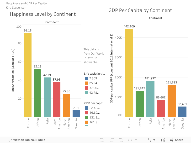
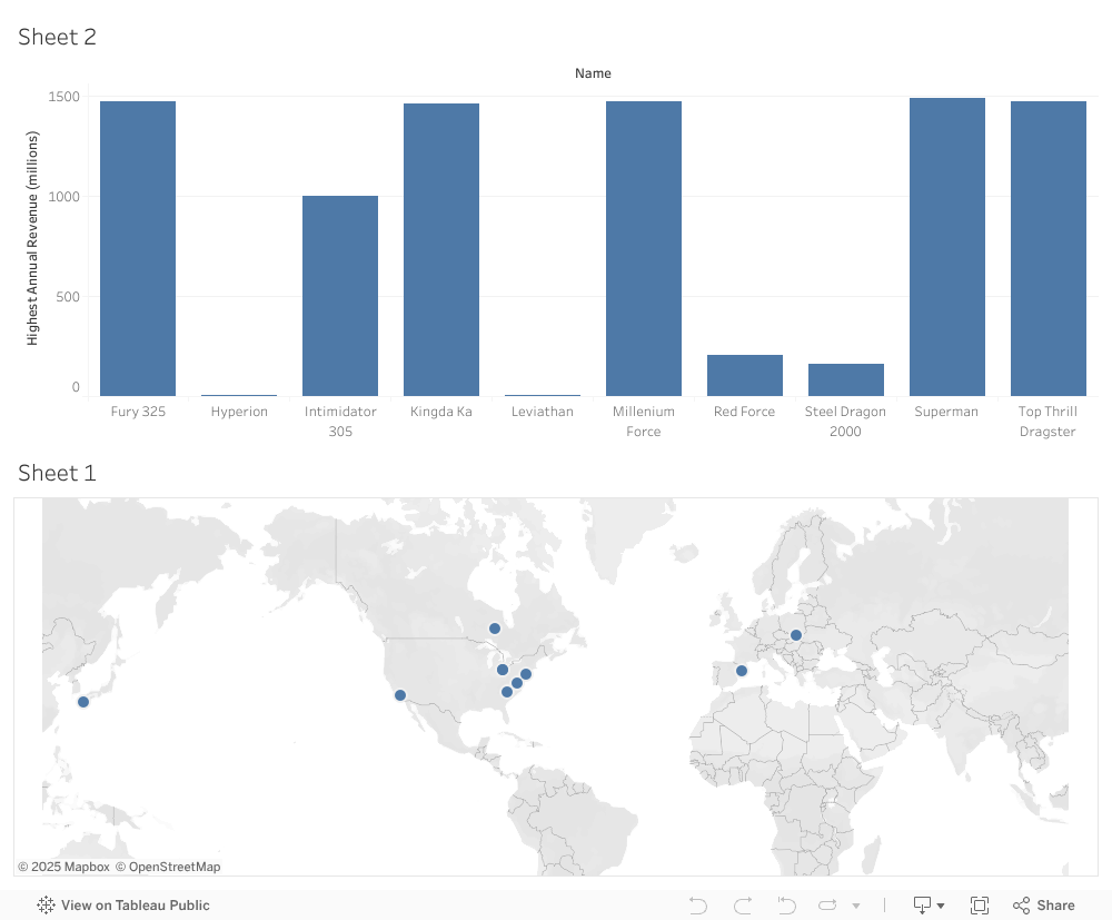
Tableau test 12/5
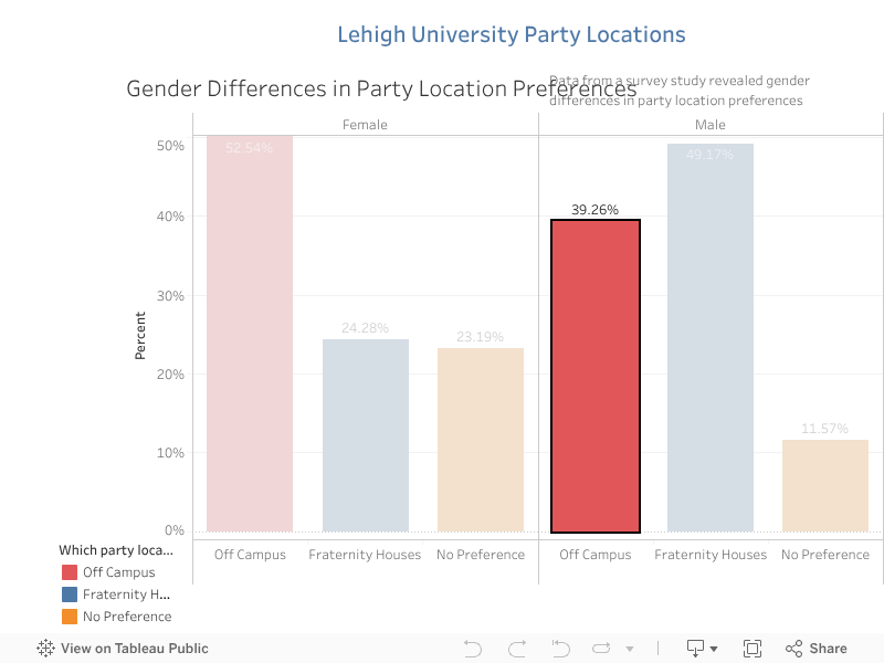
Tableau Test 11/9/2023
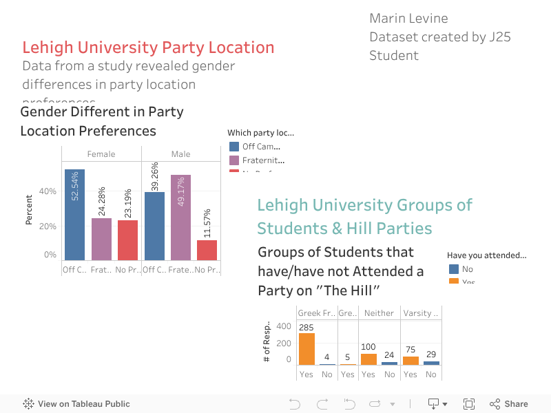
Tableau testing 2
Here is another test.
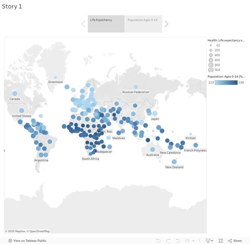
Tableau testing
This is a test.
Countries ranked by GDP
This is a bar chart created using Chartbuilder showing the world’s richese countries. Original data can be access here.


I am Haiyan Jia, an assitant professor in the Department of Journalism and Communication at Lehigh Unversity.
I research about the social and psychological effects of communication technology, e.g., the Internet, social media, mobile devices, robots, etc. I teach courses on Data Journalism, Data Visualization, Data Storytelling, Media and Society, Communication Technology, and Health Communication. Please visit my departmental webpage to learn more about my work and teaching.
I use this site mainly for my teaching of the data journalism and data storytelling courses.

Lehigh Enrollment 2017 / TEST BACKGROUND COLOR
This pie chart is created using Datawrapper as a course project of COMM 198 Data Storytelling. It shows the undergraduate enrollment in the different colleges and programs at Lehigh University in 2017. The chart shows that the College of Arts and Sciences has the largest enrollment, followed by College of Engineering and College of Business. You can also explore the other tabs of the visualization to see the gender breakdown.
Infographic testing 2

A column chart
This column chart is created also using Datawrapper. It shows very visually the size of enrollment in each of the different colleges and programs at Lehigh University in 2017 in a descending order.
Google Tour Creator
The following sample 360 immersive tour is created using Google Tour creator with the embedded Google Streetview imagery by my student Lindsey Taub.
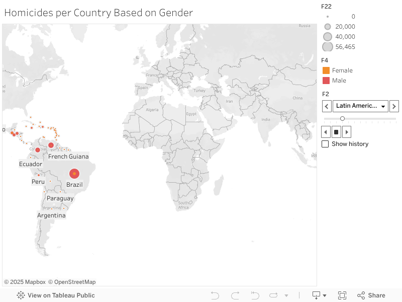
Higher Education Data Map (Updated)
A tableau project.

Test for Sumay Tableau 1
Embed code updated:
Embed code old:
Test for Sumay Tableau 2
Embed code.
Test for Meghan
Test for Venessa UPDATED
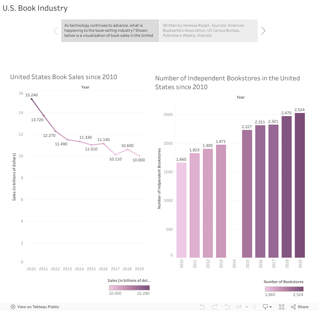
Chart Practice Spring 2021
Test picture md resize 3

<img src=https://github.com/natashabaker/natashabaker.github.io/blob/main/Profile_Picture.png?raw=true width=”50” height=”100”>
Test github 2